Give Your Custom Inspector a Little Style
Formatting
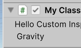
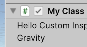
In the previous article, we ended by noticing that the left end of the Label and the left end of the FloatField in our Custom Inspector were not horizontally aligned. The FloatField is slightly indented to the right:
This is built into how Unity lays out those controls inside a Visual Element. But, you can take control of that yourself.
The Label class inherits from the TextElement class, which inherits from the BindableElement class, which inherits from the VisuualElement class. style is a public property of VisualElement, so the Label class inherits it. Using style, we can change all kinds of things about a VisualElement. Note that style itself is of type IStyle. It refers to something implementing the IStyle interface. You won’t know what that something is, but you won’t need to.
All you’ll need to know is how to use the interface.
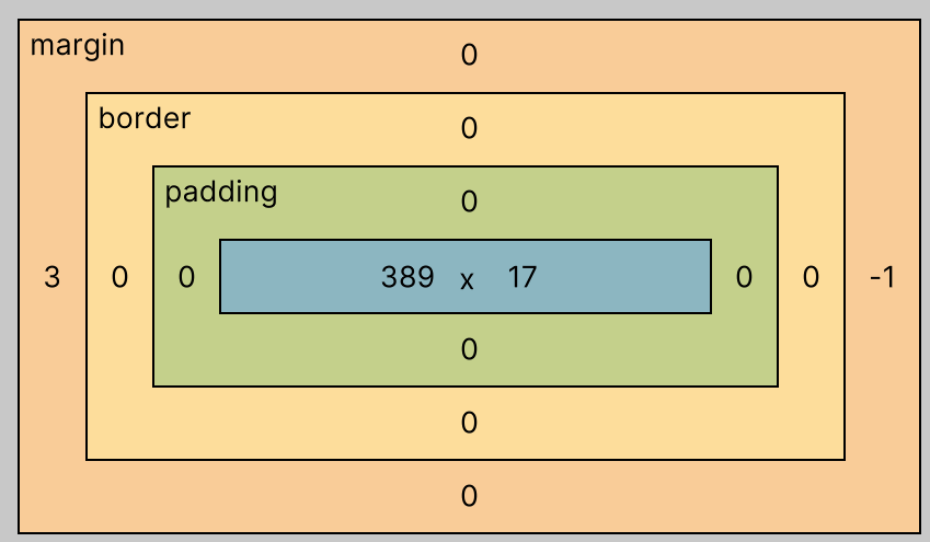
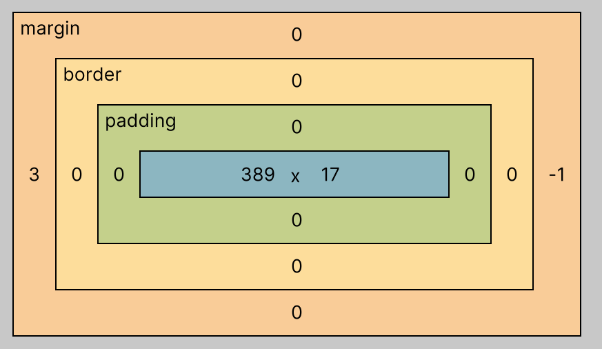
Among the many properties in the IStyle interface are four that refer to a “margin.” The IStyle interface provides these because a standard (though not necessarily universal) approach to formatting a VisualElement is to think of its contents (often text, in the case of a Label) as being contained in the smallest rectangle that will display all of that content, with the rectangle nested inside three others, like this:
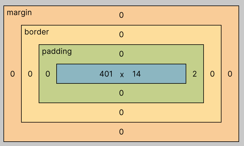
From the outside in:
- Margin is the space around the
Label. - Border is a colored boundary you can draw around the
Label. Note that it is entirely inside the margin. - Padding is some extra space between the border and the contents. Note that the padding is entirely inside the border, and that the contents are entirely inside the padding.
Those numbers are pixels. In this case, the margin and border are all zero (there is a separate number for each of the four sides of each of the nested rectangles). Only the right side of the padding isn’t zero: it’s set to two pixels, guaranteeing at least a bit of space after the end of the Label and before whatever might come after it to its right.
We can change those values in our code. To nudge the Label over to the right a bit, add this line to CreateInspectorGUI:
hello.style.marginLeft = 3;
You may note I didn’t say where to add it. That’s because, as long as you put it somewhere after creating the Label object and before the return statement, it doesn’t matter where it goes. You can change a VisualElement’s style any time, even before or after adding it to a visual tree, and the change will take effect the next time the VisualElement is drawn on the screen.
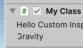
Let Unity compile that new line into your Custom Inspector and have a look:
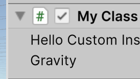
They line up! But how did I know three pixels was the right amount of margin? Hang on to your seat…
The UI Toolkit Debugger
With your Unity IDE open and your GameObject with your MyClass component selected, select Window / UI ToolKit / Debugger from the Unity menu. This will open the UI Toolkit Debugger. Make sure your GameObject is still selected. Then, click the “Pick Element” button on the debugger. Note that it changes color to let you know it is waiting for you to pick an element. Float your mouse cursor over parts of the Unity IDE, but don’t click on anything yet. You’ll see sections light up in blue. Those are all the contents portions of the VisualElement objects that make up the Unity IDE.
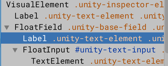
Now float your mouse cursor over the Label in your Custom Inspector and click on it. The debugger will let you see the values assigned to properties of your Label, including style settings. Look at the nested rectangles:
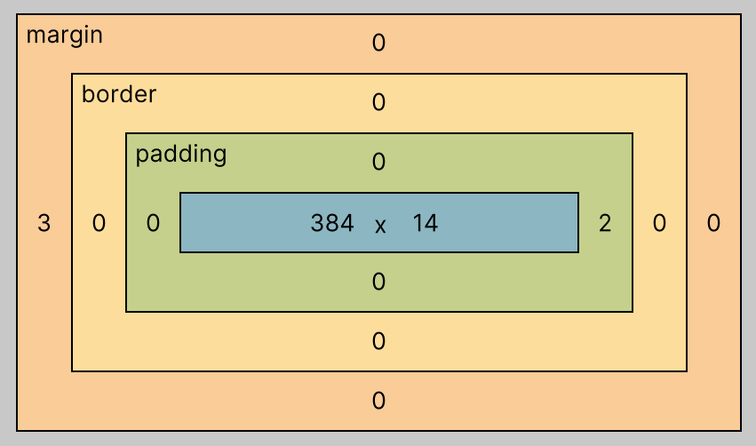
Note the “3” in the left side of the margin. That’s from the line of code you added.
The next step is a bit tricky. If you click on “Pick Element” again and then click on the FloatField, you probably won’t actually end up selecting it. Clicking on the word “Gravity” will select an element. But you may be surprised to discover it’s not a FloatField. If you look to the left side of the debugger, you’ll see the visual tree that includes the element you just clicked. If you clicked on the word “Gravity,” you’ll see it’s not a FloatField, but a Label.
That’s because a FloatField is a little visual tree all its own. Right above the selected Label in the debugger is the root of the FloatField’s visual tree, helpfully written as “FloatField.” Click on that in the left side of the debugger so it becomes the selected element.
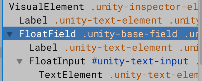
With your mouse cursor left hovering over that selection, you will see the blue box marking the content area of the FloatField in your Custom Inspector:
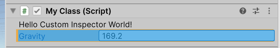
When you do, take note of the small orange area just to the left of the blue content rectangle:
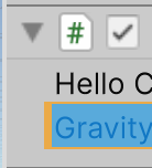
That is part of the margin for this FloatField. Looking at the debugger, you’ll see it is set to three pixels:
By using the debugger this way, I was able to find out that the reason the Label and the FloatField weren’t horizontally aligned was that the FloatField has a margin of three pixels on the left. So, by giving the Label a margin of three pixels on the left, they lined up. We can get the same effect by setting the margin on the left side of the FloatField to zero:
massField.style.marginLeft = 0;
Indeed, this makes them line up as well (be sure to remove the line that was setting the left side of the Label’s margin to 3, of course).
They do line up, but now both are three pixels to the left of where they lined up when we set the Label‘s margin to three. If you want things to line up, it might make more sense to move the indented material to the left, to make better use of your available screen space, but it’s up to you which you prefer.
Finding Child Visual Tree Elements
When you had the FloatField selected in the debugger, you might have noticed a slightly odd value for its right side margin:
What’s that negative one doing there? Could we use a negative number to set just margin of the Label of our FloatField? Yes, we can, but it’s a bit tedious and the result will surprise you.
First, we need access to the FloatField‘s Label. Confusingly, the FloatField class has a label property, but it’s not a Label. It’s just a string containing the text that goes in the FloatField’s label. To get access to the actual Label object, we need to “query” the FloatField’s visual tree.
Here’s the line of code that does it:
Label massFieldLabel = massField.Q<Label>();
That slightly enigmatic Q method lets you look for the closest child below any VisualElement that is the root of a visual tree (or, in this case, a visual subtree). You won’t find it documented with VisualElement, however. That’s because it is an extension method defined in the UQueryExtensions class. You can run it on any VisualElement object (and, therefore, any object in a subclass of VisualElement). It will return a reference to the first child object it finds of the type specified in the angle brackets, or null if it can’t find one.
Let’s use that reference to set the left margin of the FloatField’s Label to negative three:
massFieldLabel.style.marginLeft = -3;
Let Unity compile that and have a look:
It worked… sort of. The Label did move three pixels to the left, but it is being clipped at the boundary of the content area. Probably not what you want, so best not to use this option.
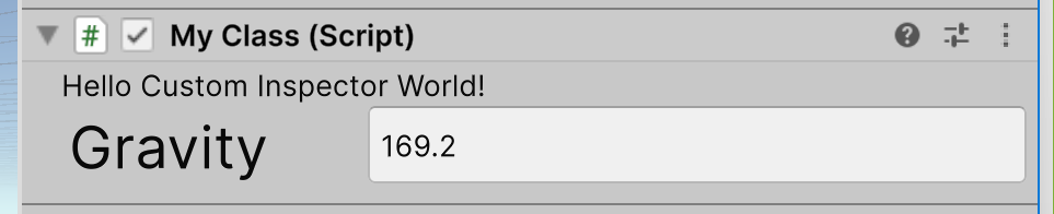
As long we have the Label reference, what else can we do to set its style? Lots of things! As just one example, we can change the size of the text:
massFieldLabel.style.fontSize = 24;
A size of 24 gets you this:
We’ll leave this topic for now, but we’ll come back to it when we look at using the graphical UI Builder. While it is easy to change the FloatField’s Label‘s style in code, it turns out to be difficult in the UI Builder. One approach you can take is to use a USS “style sheet.” If you are a web developer, this will be familiar to you as akin to a Cascading Style Sheet. But if you’re not used to those, you may find it a bit of chore to learn and use. In that case, knowing you can control style directly from C# code may come in handy.
In the next article, we’ll add a little more help for the user, in the case where our Custom Inspector corrects a negative number to zero, with a popup window.
Leave a comment
Log in with itch.io to leave a comment.