Flexible Layout in Your Custom Inspector
Layouts
Our Custom Inspector has given us some extra power over our MyClass component, by enforcing a limit and letting the developer know when enforcement happens, and why. But, so far, both our pure C# and UI Builder interfaces have been strictly top-to-bottom. As you know, Unity’s built-in Inspector can lay things out from left-to-right, as well:
We can do the same thing in our Custom Inspector. Let’s make a new, very simple class:
using UnityEngine;
public class AnglesCustom : MonoBehaviour
{
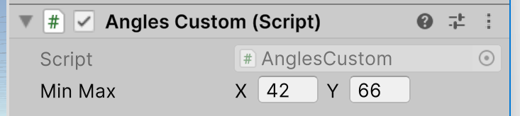
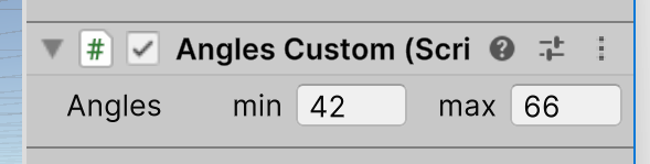
public Vector2 minMax = new Vector2(42, 66);
}
The built-in Inspector already lays out the values in our Vector2 field horizontally:
To a certain extent, it also adapts the layout when we widen the Inspector pane:
The fields holding the numbers became wider. That’s good UI design. You don’t want your controls glued to one side or the other of your GUI (or the middle of it, for that matter). Making them grow and shrink to use the space available works better.
But look at the space taken up by the label, “Min Max.” That became wider too. That’s not good UI design, because it wastes screen space for no good reason.
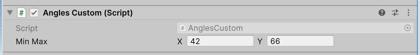
Using the techniques we applied before, let’s use the UI Builder to create a simple Custom Inspector for our new AnglesCustom class. Do that by adding a single Vector2 control and binding it the minMax member of the AnglesCustom class:
In its smaller layout, it looks a lot like the built-in Inspector. Let’s widen it and see what happens:

Notice that the label does not get wider. Why would it behave differently before we’ve made any changes to its initial, default configuration?
That’s hard to answer, because we don’t really know how Unity created the built-in Inspector. Using the UI Toolkit debugger, you would see that most of the style settings are the same for the Vector2 control the built-in Inspector uses, and the one your Custom Inspector uses. But way down at the bottom, you might see that the “width” of the Vector2 control’s label is set to “auto” in your Custom Inspector, while it is a number in the built-in Inspector. And, that number changes when you change the Inspector’s pane’s width.
It’s only a guess, but maybe this harkens back to how the Inspector was created before it was written to use the UI Toolkit. The “width” style property of the label is marked as “inline,” which means it’s being set directly to that value, specifically for that Label object. We’ll see later how you can set style information for whole groups of things without having to do so specifically for each one, but it appears that’s not how Unity’s built-in Inspector works now, at least not all of it.
This is good news for us! It means we can take control of the UI’s layout and have it do a better job of adapting to changes with our Custom Inspector than the bulit-in Inspector does.
Control Labels
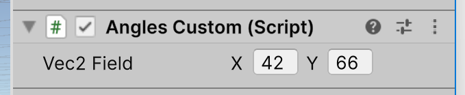
We left the label of our Vector2 control alone creating it, so it says “Vec2 Field.” That’s easy to change in the UI Builder. But note that there are actually three labels in the control: the one to the left of the two fields that hold numbers, but two more just left of each of those fields themselves. They are set to “X” and “Y” when the Vector2 control is added. Can we change them?
We can, but it’s messy. Try inserting this code in your CreateInspectorGUI method:
        var floatField = root.Q("unity-x-input");
        var label = floatField.Q<Label>();

        label.text = "min";
        label.style.flexBasis = 30;
This will find the VisualElement named “unity-x-input,” and then find the Label that is a child of that VisualElement in the visual tree. After that, it sets the text to the new label we want to see, and its width to 30 pixels. You’ll note that the “width” here is a style property called “flexBasis,” which is really what we want to be dealing with, but we’ll get to that shortly.
Instead of using the Vector2 control, which makes changing its labels painfully difficult, let’s build our own UI to show two floating values with labels we can control. To start, let’s make a small change to our AnglesCustom class:
using UnityEngine;

public class AnglesCustom : MonoBehaviour
{
    public float minAngle = 42;
    public float maxAngle = 66;
}
We’ll create a UI in the UI Builder to show these values, but on the same row. Here’s the visual tree:
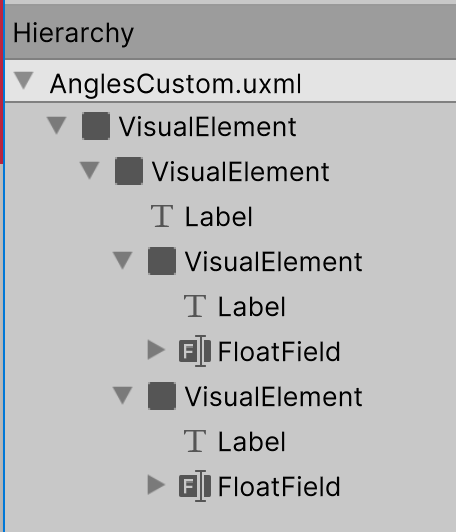
This will be a bit of a cookbook approach, but you should have a good enough idea by now of what each of these steps does that (most of them) won’t need much explanation. To build that tree, do this in the UI Builder:
- Create a Visual Element
- Set its “Flex / Grow” to zero. This is something new. “Flex” is the system Unity uses in UIs to adjust the sizes of rectangles that enclose other rectangles, collectively laying out your whole UI. Each rectangle has a major axis (either horizontal or vertical) and a cross axis (at right angles to the major axis). The “Grow” number is part of a numerical ratio with other Grow numbers that controls how much a rectangle grows along its major axis when there is more than enough space in their enclosing rectangle to show them all at their initial size. We don’t want this one to grow at all, so we’ll set its Grow number zero.
- Drag and drop another Visual Element to be a child of the first one.
- Set its “Flex / Direction” to “row.” This sets is major axis to be horizontal.
- Drag and drop a Label to be a child of the second Visual Element.
- Set its “Flex / Basis” to 50px. This sets the initial size in pixels of the element. The “Shrink” and “Grow” numbers manage how it gets smaller or bigger when there isn’t enough space in its containing rectangle to show it at this initial size along with everything else in the same rectangle at everything else’s initial size
- Set its “Flex / Shrink” to 1. When things give up space to shrink, they’ll do so in proportions based on the rations of their “Shrink” numbers.
- Set its text to “Angles.”
- Set its “Display / Overflow” to “hidden.”
- Set its “Text / Align” to “middle.”
- Set its “Text / Text Overflow” to “ellipsis.”
- Drag and drop a third VisualElement to be a child of the second one.
- Set its “Flex / Basis” to zero.
- Set its “Flex / Direction” to “row.”
- Drag and drop a Label to be a child of the third VisualElement.
- Set its text to “min.”
- Set its “Display / Overflow” to “hidden.”
- Set its “Text / Align” to “right.”
- Set its “Text / Text Overflow” to “ellipsis.”
- Set its “Flex / Shrink” to 1.
- Drag and drop a FloatField to be a second child of the third VisualElement.
- Set its label to be an empty, zero-length string.
- Set its “Flex / Basis” to be zero. An initial size of zero means an element has to grow to be seen.
- Set its “Flex / Grow” to be 1. So it will, in fact, grow and be seen.
- Set its “Editor Binding Path” to be “minAngle.”
- Select the third VisualElement and press Ctrl-D to duplicate it.
- Change its Label’s text to “max.”
- Change its “Editor Binding Path” to be “maxAngle.”
Save your UI in a file called “AnglesCustom” and put this in a folder named “Resources.”
Now use this as the CreateInspectorGUI method in your Custom Inspector class:
    public override VisualElement CreateInspectorGUI()
    {
        VisualElement root = new();

        VisualTreeAsset visualTree = (VisualTreeAsset)Resources.Load("AnglesCustom");

        visualTree.CloneTree(root);

        return root;
    }
Note that, in this
CreateInspectorGUImethod, we did not makevisualTreea public member field of the class. Instead, we made it a local method variable. To load the UXML file and create theVisualTreeAsset, we used the staticResources.Loadmethod. For this to work, the UXML file must be in a directory subtree withResourcesas its root. There’s no great advantage to one way of settingvisualTreeover the other. Both work, so use whichever you prefer.
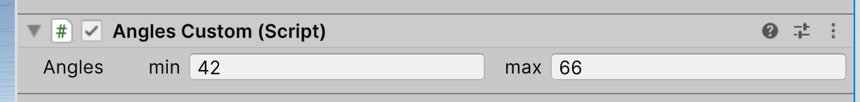
Now when you use your Custom Inspector, the label of “Angles” uses a fixed maximum amount of screen space, as do the “min” and “max” labels for your FloatField controls.
Only the FloatField controls get larger. This is a better use of screen space than just proportionately enlarging everything.
Understanding the “flex” (from the web “FlexBox” layout manager”) can be hard. You should experiment with it as you also study the Unity manual pages on it.
In the next article, we’ll reach our original goal of making sure the min angle is never above the max angle, nor the max below the min.
Leave a comment
Log in with itch.io to leave a comment.